

Author

6 Minute Read
TLDR;
Nostalgia isn’t a look—it’s a playbook. This is your step-by-step walkthrough for testing retro cues that actually move numbers. From picking one era signal to tracking CTR, conversion, and repeat rate, every section gives you something to test this week. Real moves, real metrics, real lift.

Everything suddenly looks like it came off a VHS tape and for good reason. In markets that feel shaky, familiar design reads as safe, trustworthy and downright gold for CPG brands. One bold retro cue can do the heavy lifting of a big ad buy on the shelf, on Amazon and in your customer’s brain.
Here’s the kicker: most brands overdo it. They slap on a gradient, borrow a throwback logo, and call it a retro moment. The standouts? They’re sharper. Think Taco Bell’s Y2K chrome-finish packaging or Miller Lite’s white cans that look like they rolled straight out of your dad’s garage fridge. Forget gimmicks. This is calibrated recall—a design cue that carries emotional freight and drives real shelf performance.
Here’s the Neato way: intentional, measurable, modern. We’ll show you how to repurpose nostalgia in a way that feels timeless but executes like strategy. Because it’s not about dressing your brand in vintage clothes, it’s about making the past work for your future.
Why Nostalgia Works

When uncertainty rises (economic wobbles, social upheaval, existential dread), we reach for the familiar. We associate past eras with simpler times, even if they weren't objectively simpler. That retrofitted emotional warmth transfers to brands that tap into it. You're not just buying a soda. You're buying a ticket back to summer afternoons in 1997.
A meta-analysis of over 9,700 samples found nostalgic cues can overwrite typical decision factors, meaning consumers value sentimental memory more than price or features. What makes this particularly potent now is anemoia: longing for a time you never experienced. Gen Z doesn't remember the actual 90s, but they're obsessed with 90s aesthetics because they represent pre-digital innocence.
CPG's unfair advantage is tangibility. The weight of a glass bottle. The snap of a pull-tab. The waxy texture of a wrapper. These aren't abstract brand values. They're body memories that photograph, thumbnail, and shelf-scan as "familiar." Used sparingly, a single cue raises attention without breaking systems.
A Choose Your Own Adventure Type of Toolkit
Everyone’s rocking their “something-era.” Taylor Swift has her Eras Tour. Kylie Jenner is back with her “King Kylie” era. Your TikTok-obsessed friend just launched her “soft-girl era” or “delulu era.” But here's the thing: influencers can swap aesthetics overnight and call it a rebrand. CPG brands can't.
Considering a rebrand of your own? Before you tear down your logo and start your “new era,” check out The Rebrand Trap — our guide to making sure you’re fixing the right problem before calling the designer.
You have supply chains, print minimums, and Amazon thumbnails that need to work at 150px. Nostalgic design has to feel intentional, not like you picked a decade out of a hat because it was trending on Pinterest. Each visual era carries distinct cues, emotional echoes, and performance implications for your specific audience.
So before you drop a Y2K gradient or 70s wood grain, ask: which era actually fits your brand and target demo, and which one just sounds trendy? Here's your playbook to test era signals with precision.
Rule one: Pick one cue per test. Stack them only after each proves out individually.
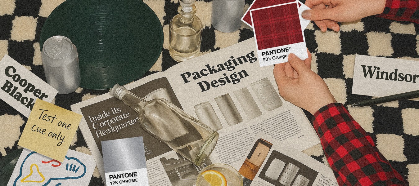
Era Cues (pick one)
Each decade carries its own visual DNA and performance baggage. Choose the era that fits your brand, not just what looks good on a mood board.
Y2K: Chrome finishes, holographic foils, magenta-to-cyan gradients, electric neon. Optimistic futurism before the future got complicated. (Great for energy drinks, beauty, anything targeting younger demos); strong mobile thumbnail pop.
90s Grunge: Muted earth tones, distressed textures, photocopier collage aesthetics. Less polished, more DIY. (Craft beer, authenticity plays); helps retail contrast without muddying thumbnails.
80s Memphis: Bold geometric shapes, primary colors, squiggles. Playful confidence when used with restraint. (One or two elements, not pattern explosion); high thumb-stopping power in social ads.
70s Earthy: Burnt orange, avocado green, harvest gold, wood grain. Maps beautifully onto sustainability trends. (Kombucha, organic snacks, farmer's market vibes); premium perception without premium pricing.
Faded Film: Muted pastels, desaturated tones. Not era-specific but evokes old photographs losing saturation. Creates instant wistfulness. (Strong for DTC storytelling and brand recall).
Type & Graphics (pick one)
Once your era is nailed, typography and graphic texture become your conversion levers. The right font or halftone texture doesn’t just whisper nostalgia. It drives attention, builds trust, and keeps your product performing whether it’s on the shelf or in the scroll.
Chunky retro sans: Cooper Black, Windsor, rounded terminals. Legible even at 150px for PDPs. (Sports drinks, bold shelf presence).
Hand-lettered scripts: Feel like someone's mom wrote them in the 70s. Trust signal, artisanal perception. (Craft brands, farmer's market products).
Halftone micro-texture: Reference old printing processes. Analog warmth on one A+ module without overwhelming. (Photographs well for social).
80s dimension: Simple drop shadow, beveled, or extruded text. Wink without chaos. (Single headline use, not body copy).
Illustrative linework: 60s/70s cookbook style. Premium, handmade perception. (Organic, small-batch positioning).
Materials & Format (pick one)
Last piece of the puzzle! What your customer actually touches matters. Material cues and format strategy can turn throwback vibes into real-world premium perception and repeat purchase behavior. Think collector’s-edition. Think Labubus!
Matte over gloss: Photographs better, reads premium, feels more nostalgic. (Works across all channels).
Glass pilot: On one DTC SKU to test value perception. References pre-disposable era. (Can command 15-25% price premium if story lands).
Kraft/uncoated boards: Signals quality and sustainability. Better review sentiment on perceived value. (Farmer's market, organic plays).
Limited sleeve collectible: Throwback designs, commemorative runs, peel-back labels with hidden illustrations. Taps nostalgia's hoarding impulse. (Drives repeat purchase).
Soft-touch coatings: Letterpress-style debossing, foil overprints. Tactile storytelling that photographs well for UGC. (Premium positioning without redesign).
Test it this week
Swap your Amazon main image to include one era cue. Track CTR vs. control for 7 days. If you see meaningful lift, move that cue into A+ and social.
Real Nostalgic Brands & Lessons
Pepsi logo refinement: In 2023, Pepsi unveiled a new visual identity that nods to its 1970s–90s heritage.
Lesson: Heritage signals, when modernized rather than mimicked, can rekindle equity and resonate with younger consumers.
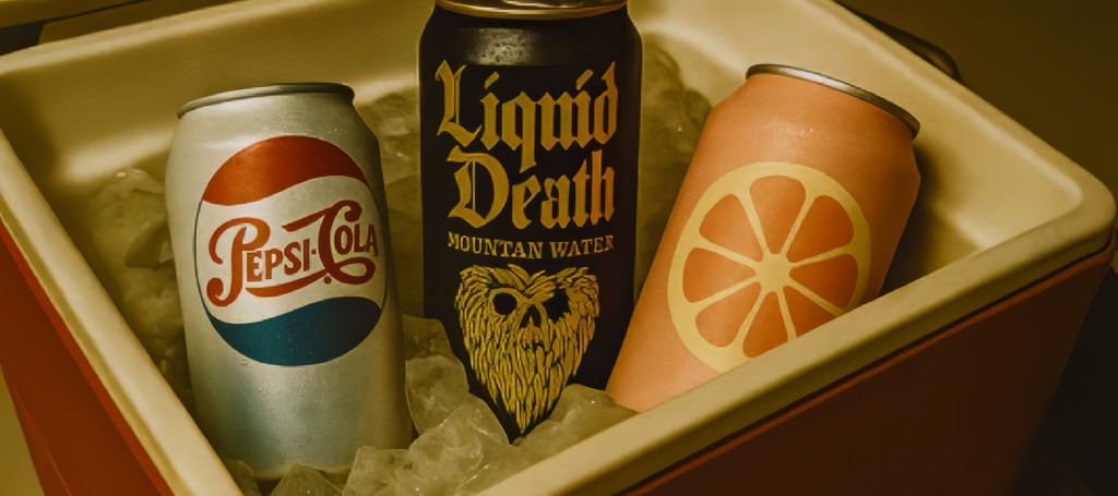
Liquid Death tallboy innovation: Punk format + anti-brand attitude breaks water category sameness; thumbnails stop the scroll. By 2023, Liquid Death reported $263 million in retail sales and achieved triple-digit growth for the third consecutive year.
Lesson: A bold format and distinctive aesthetics can turn a commoditized category into a premium, buzz-worthy brand—proof that design ≠ gimmick.
Poppi soda cues: Bright, bubbly "classic soda" look paired with wellness copy = familiar + new, strong trial and recall. Within six months, Poppi achieved a 16× increase in new-to-brand customers and 34% of ad-attributed sales in Q1 2022 came from those customers.
Lesson: You don’t need decades of legacy to succeed. One credible visual cue + modern positioning = strong trial and growth.
Your Nostalgic Five-Step Blueprint

Use this as your short sprint playbook: one smart move at a time.
1. Memory Audit
Pull reviews and social to find what customers romanticize; map to one plausible era.
Test This Week: Poll IG stories with two era boards; pick the winner.
2. Choose Your Angle
Subtle, Reference, or Throwback. Then set a max intensity so you don't overdo it.
Test This Week: Build two thumbnail variants at different intensities.
3. System It
Add a "nostalgia dial" to your design system (color, type, texture) with 150px thumbnail legibility baked in.
Test This Week: WCAG contrast check + 150px read test.
4. Activate
Treat it like a drop: DTC pilot, then Amazon rollout, then retail endcap if it performs.
Test This Week: Retro sleeve for top DTC SKU; collect UGC and use it in A+.
5. Measure and Evolve
Track CTR, CVR, repeat rate, and "quality/authentic" mentions in reviews. Scale only if two KPIs move.
Test This Week: Compare performance week-over-week and tag qualitative mentions for future design iterations.
Your Testing KPI Framework
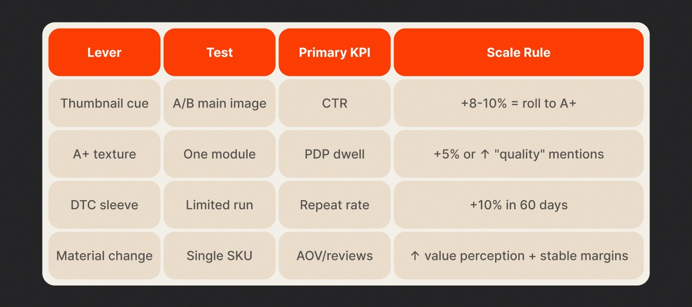
Before you scale nostalgia, you have to prove it performs. Here’s how we track every test, what to measure, how to read it, and when to hit scale.
How to Interpret This at a Glance
Thumbnail cue / CTR: Your image’s job is stop the scroll. If your click-through jumps 8-10%, you’ve hit visual resonance.
Texture / PDP dwell & quality mentions: Once they land, you want them to stay, scan, feel. A bump in dwell or more “premium” mentions confirms depth.
Limited sleeve / repeat rate: Nostalgia that’s collectible drives return buys. A +10% repeat rate in 60 days signals you’ve unlocked community or fandom.
Material change / AOV & reviews: Upgrading finish or format? You’re testing value perception. If AOV climbs and review sentiment tilts positive—while cost pressure stays controlled—you’ve earned the premium.
Why It Matters for You
Nostalgic design isn’t just decoration. It’s a performance lever. The brands that win treat visual cues like hypotheses—not sketches. They test, measure, iterate.
Use this framework to make your packaging plays measurable, repeatable, and strategic.
Ready to experiment? Pick your lever, set your baseline, and let the data prove your throwback aesthetic.
The Neato Nostalgia Stress Test
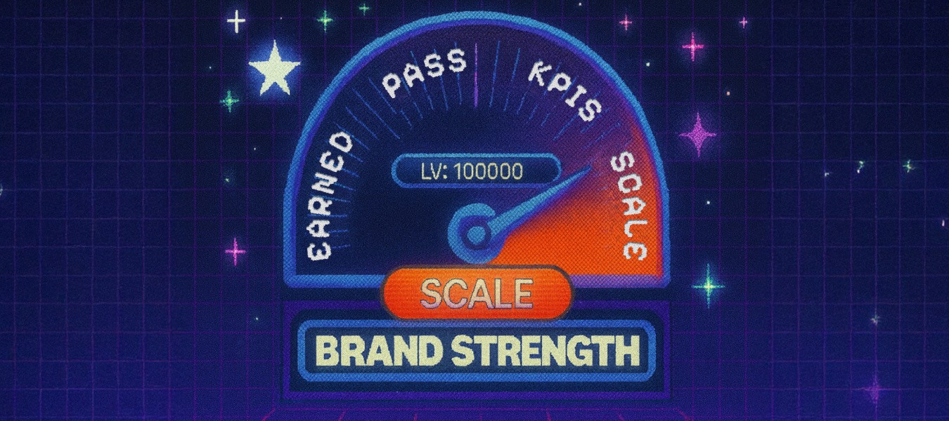
Before you scale your nostalgic bid, run each of these checks like your brand agreement depends on it (because it does).
Run this stress test before every nostalgic play.
If you pass all six, you’re ready to scale with confidence. If not, adjust the cue, tighten the message, and run it again. That’s how nostalgia stops being costume design and becomes conversion design.
1. Earned vs. Forced
Ask yourself: Did we earn this nostalgia, or are we borrowing it?
Heritage brands have the receipts — they can dig deeper into archive design and history.
Newer brands need a lighter hand. A subtle reference feels strategic; a full-on costume feels desperate.
✅ Pass if your nostalgic cue connects directly to your brand’s story or origin — not just because it looked cool on Pinterest.
2. Legibility & Impact
Online shoppers don’t zoom. If your label isn’t clear at a glance, you’re losing conversion.
Shrink your creative down to thumbnail size and check: Can I still read the name? Recognize the product? Feel the vibe?
✅ Pass if it’s unmistakable, even when tiny. If not, simplify.
3. One Cue at a Time
The biggest mistake brands make? Mixing all the signals: retro color, vintage type, grainy texture — until it’s aesthetic soup.
Pick one nostalgic lever per test. Lead with color, or typography, or texture, but never all three.
✅ Pass if your design communicates one clear nostalgic message instead of visual chaos.
4. Cross-Channel Fit
Your nostalgia needs range. It should look just as good on an Amazon PDP as it does on a retail shelf or Instagram carousel.
Ask: Does this design translate across every channel we sell in?
✅ Pass if it’s cohesive across Amazon, retail, and DTC.
5. Exit Plan
Even the best ideas need a clean exit. Limited runs let you test nostalgia without locking your brand into a look that might not perform.
Mark it as a drop. Set an end date. Preserve collectability, avoid fatigue.
✅ Pass if you can walk away in 60 days with data and dignity.
6. Pre-Set KPIs
Nostalgia only works when it performs. Define success before you hit go.
Decide which metrics matter — CTR, dwell time, repeat rate, or review sentiment — and record your baseline.
✅ Pass if you know exactly what “winning” looks like before you launch.
How to Use Neato Nostalgia Stress Test
Run each line as a pre-launch checklist. Score each item 0–10 to spot weak points.
Don’t skip the “exit plan” just because it feels safe. Limited runs fuel urgency, not second-system fatigue.
Review results at day 7, day 30, day 60. If you’re hitting threshold KPIs early, ramp fast. If you’re leaking, pause and revisit.
